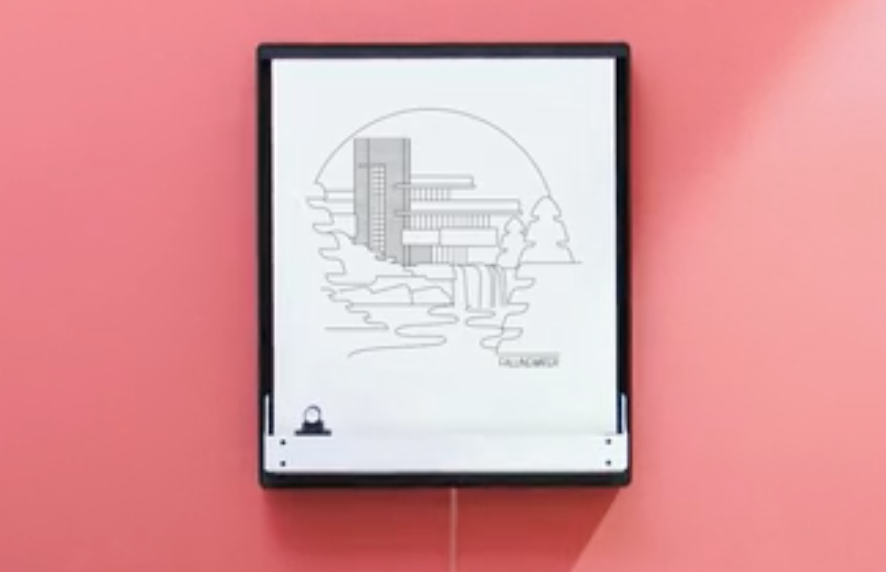
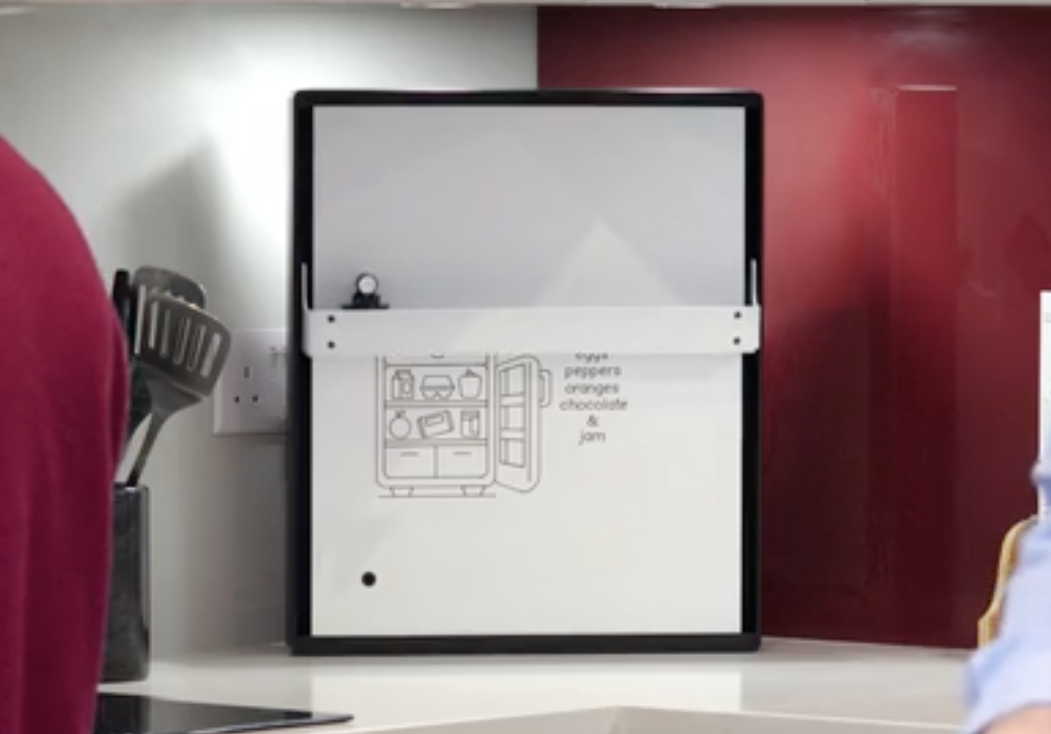
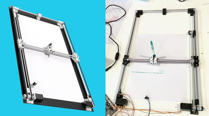
Joto is an “internet connected drawing board”; it’s whimsical, and it’s fun. But I just can’t shake my doubts about it.
I’m genuinely hesitant to be critical about what is certainly many, many months of hard work and effort by Joto’s designers and creators. They should be applauded and celebrating for enduring the hard work required to bring an idea to life.
However, Joto serves to highlight an emerging pattern in consumer “internet of things” devices that it’s worth making explicit. We’ll explore that below, under “Context”.
But first, let’s strip away the marketing and understand what Joto actually is.
“Off screen”, on a screen
At the end of the video, the voiceover tells us:
Some things in life are just better off screen.
It’s increasingly popular to frame technologies as post-screen or beyond screens; beyond the world of information, as BERG coined,“trapped behind glass”. Indeed, there’s some genuinely interesting work exploring devices that support interactions without screens.
But the output of Joto is visual in two dimensions, and so really it’s just a different kind of screen. It’s a screen that’s always visible, glanceable, and perhaps more aesthetically pleasing. And, perhaps this makes it more appropriate to be mounted in places we are not accustomed to be bombarding us with backlit displays. That aspect alone could be enough to change your personal relationship with it as an object…
… but it is still fundamentally a screen, and as a screen, it has some significant drawbacks.
It’s slow, because it’s mechanical

I’d estimate that it takes at least 30 seconds to draw a simple “jot”, and at least five minutes for a complex piece of art like the rendition of “waterfalls”. That’s a long time to wait, in screen terms.
The Kickstarter video indicates that you’ll be alerted to new “jots” on your phone, which you can then use to tell Joto to draw. At this point point you’ve probably already seen what’s going to be drawn in a preview, and so all that remains is whatever residual delight there is in watching Joto recreate the image over the many minutes it takes to do it’s job.
The alternative, that Joto might automatically start drawing as soon as an item is received, has its own drawbacks.

Imagine if you wake up to find the todo list you scheduled for display before breakfast has been erased and drawn over by a well-meaning but ill-timed message from a friend? Are you going to wait for Joto to re-draw your list?
It’s noisy (because it’s mechanical)
This is potentially much more significant. It’s hard to say for sure, because all of the instances of it drawing in the main Kickstarter video don’t include the environmental audio, but it’s quite likely that Joto won’t be silent in operation.

This effectively cancels out the idea that Joto, as a screen, is less intrusive than something more traditional. From the moment drawing begins its actuators herald the oncoming “jot”, your attention is not only demanded but held, as the noise only abates when the drawing is complete. This also undermines the “wake up to a todo list” scenario, since the noise from the plotter will pre-empt any alarm you might have set to start your day.
It’s very possible that the final version will be significantly quieter than the prototypes, but even at a whisper, if you’re sharing a room with Joto, it’s whisper of operation will act as the quiet, sustained rustling of someone nearby who, in five or ten minutes, may have something to tell you.
Context
So if Joto is slower than many other display technologies, and operates more loudly than many other display technologies, what is it that Joto excels at?
It all comes down to context. Joto is really just a plotter printer in a different context, the same way that Little Printer was just a fax machine in a different context. Joto represents the translation of an old, “boring” technology via some updated design into a new environment: the home.
The question is, then: is the home the right context for it to be in?

Joto started life as something drawing on shop windows, which are by their nature much more about communication and spectacle. The things which might make Joto’s precursor captivating and effective on public display might not easily translate into the quiet private solace of your home or workplace.
As a device, and even as a screen, it has spades of charm, whimsy, and for some even delight, but as a design choice it brings relatively little utility. If the former outweighs the latter enough for you, then perhaps you will welcome Joto into your home.
But much as I try to stifle my cynicism, I can’t help but think that it’s not always enough to just take an existing object, make it smaller and bring it into the home context, as hard a task as even that might be. While Joto might be able to reduce the already-minimal friction required to share sketches or notes with friends and colleagues over the internet, it does so using a mechanism that’s wholly unsuited for doing so.
If you had the choice between Joto, and a silent, transparent, e-Ink display on your wall, which would you choose? My point is not to compare things based on metrics like speed or operating noise alone, but to ask to what extent products like Joto are just a wilful rejection of those metrics. And maybe it’s perfectly fine to do that, but I think when such aspects form a significant part of the choices we make, it’s worthwhile to do so consciously.
I genuinely do wish the makers of Joto every success, and it’s very possible that my perspective on the device is missing key insights that would flip the subjective balance of utility vs. charm even for me. I suppose only time will time.